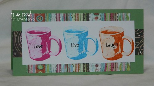
 So how's this for bright? I wanted to do some sort of line-up with the mugs, and this is what I came up with. I drew the colors from the paper (BasicGrey Phoebe), and while they're definitely not my "norm" I think they're kinda fun. The words on each mug are from the Middie Messages #2 set, and I used a marker to ink the words up individually. I must say that this card would not have been possible without the stamp-a-ma-jig; I used it for each mug as well as the words. I'm still marveling the fact that Sarah Kornhaus was able to create this gorgeous card without the SAMJ!
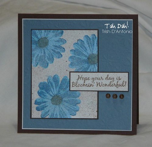
This is another card that I needed the SAMJ on - the daisies are gorgeous, but it's really important to line them up properly. I made the daisies by first stamping the second layer image with palette cote d'azur, and then the 3rd layer with palette beaux arts blue. I wasn't happy with the result, though, so overstamped with the solid (generally the 1st layer) using brilliance pearlescent sky blue. Much better! I then added the centers (versafine sepia) and misted the panel with some denim blue & coffee shop glimmer mists. I then stamped the sentiment (Bloomin') and gave that panel the same glimmery treatment. I embossed the blue panel (Ellison daisies emb plate) and added a few dew drops for a bit more dimension.


2 comments:
Love that mug card! Great colors, layout, and dp!
Trish, thank you!!! What a nice encouragement re: my coffee mug card!
I have decided though, it's time for the SAMJ! Kills me to spend the money, lol, but it's TIME! :-)
Post a Comment